
Modernizing MaaS360’s dashboard
Led and owned the design process-
- Defined business value
- Conducted user research
- Created design framework
- Delivered dev ready mockups
- Facilitated user feedback sessions
- Drove C-suite consensus to push to production
The facts
~
60
%
Adoption rate during beta testing

72
%
No:of clicks for key workflows
27
%
Time to complete key workflows
The art
Problems with the existing homepage
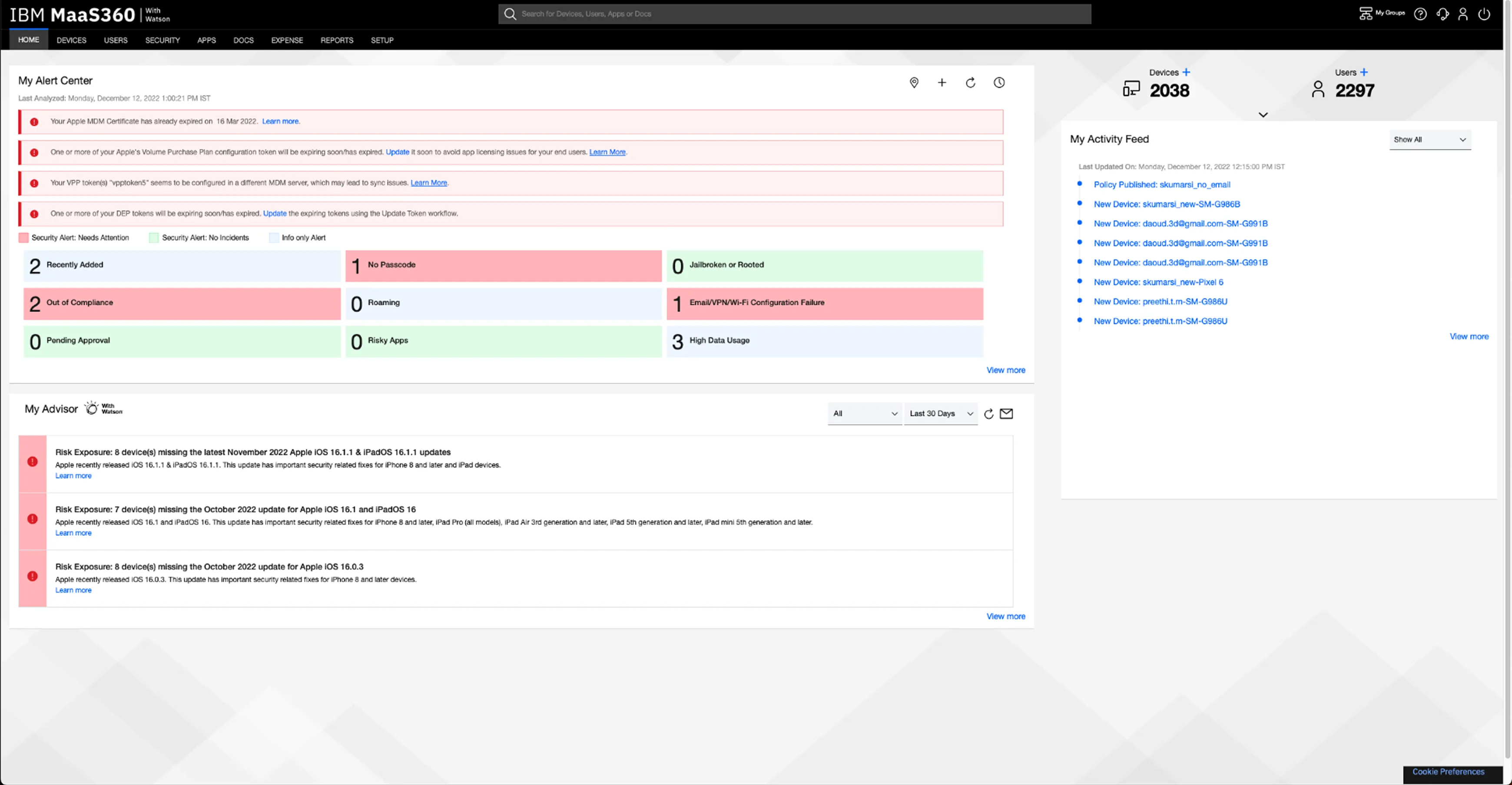
Lack of a summarized system status
IT admins are required to view multiple pages to gather information, to later piece it together from memory to form a complete understanding.
Deep and lengthy navigation paths
Our product offers a rich amount of information, however users need to follow lengthy workflows to find the details they need.
Lack of flexibility
Existing capabilities lack contextualization, adding unnecessary noise/information to customers with specific needs.
The homepage
should help IT admins
begin with their day
The older homepage, designed in 2012, lacks tools for quick monitoring, support data-driven decisions, and efficient management of their deployment. Admins were forced to navigate deep into the product to find relevant data.
It was important to establish the ( Need ) for modernising and ( Ensure ) all ( Stakeholders ) were aligned.
Gaining
Stakeholder
Buy in
To create customer benefit and bring this to life complete stakeholder support was required. I focused on articulating the problem in a way that resonated with the stakeholders’ priorities and needs.
Prioritisation

Partyyyyyyyyyy 🎉
Let’s ship
After multiple rounds of collaborative workshops, this project received executive support. The long journey from an internship concept to productisation was a happy moment.
With the gears set in motion, it was time to flesh out the user experience!
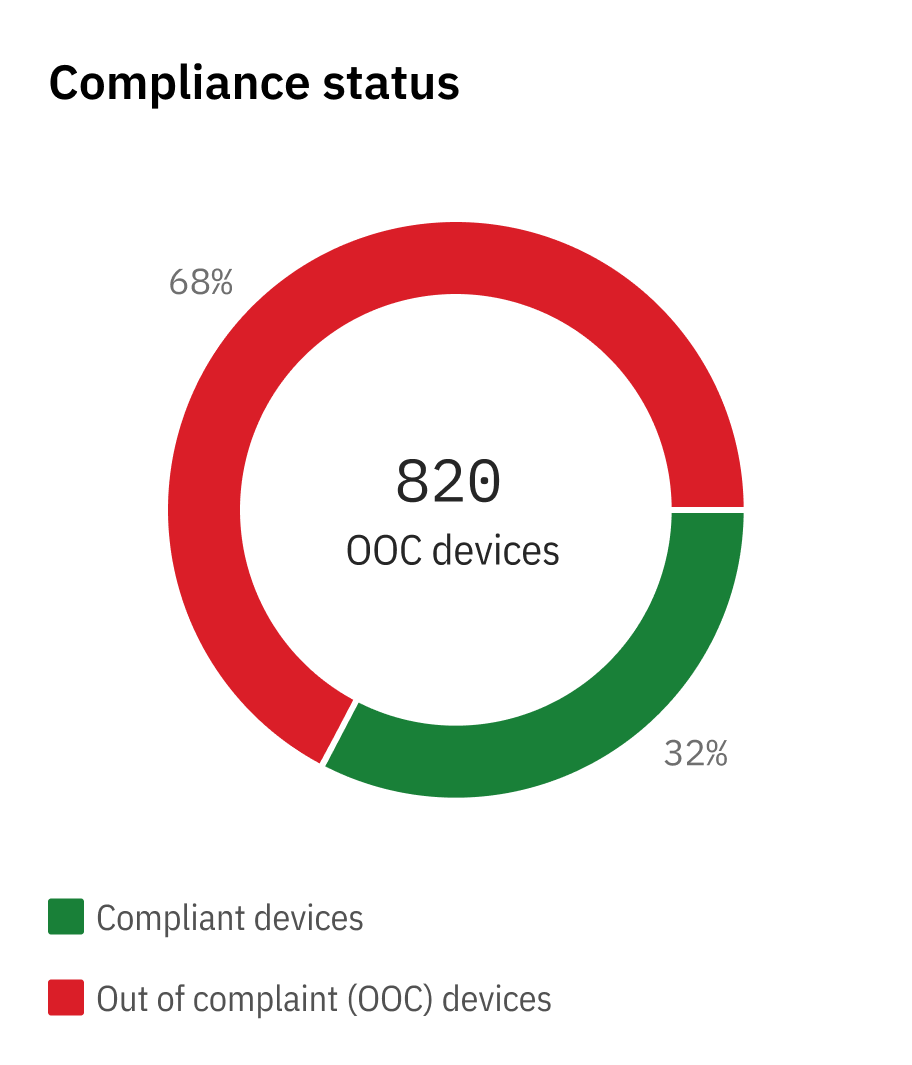

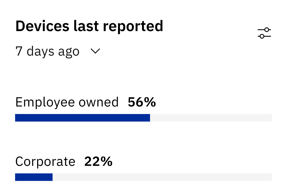
Data widgets reduced no:of clicks by 72%
Designed micro layout systems to ensure consistency and scalability with future widgets
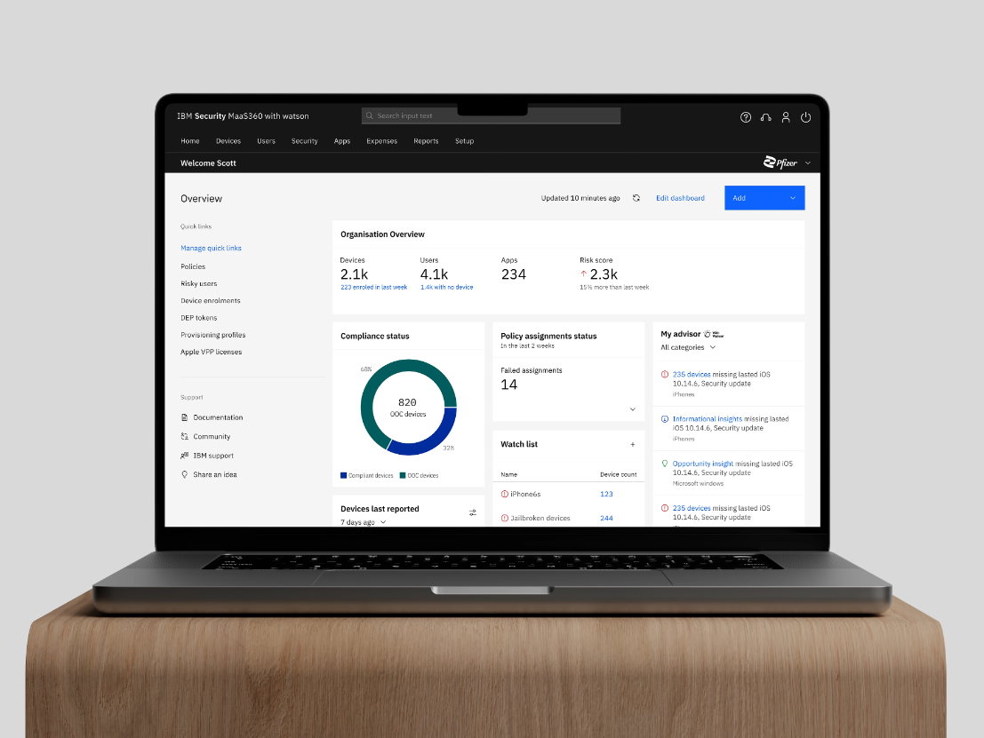
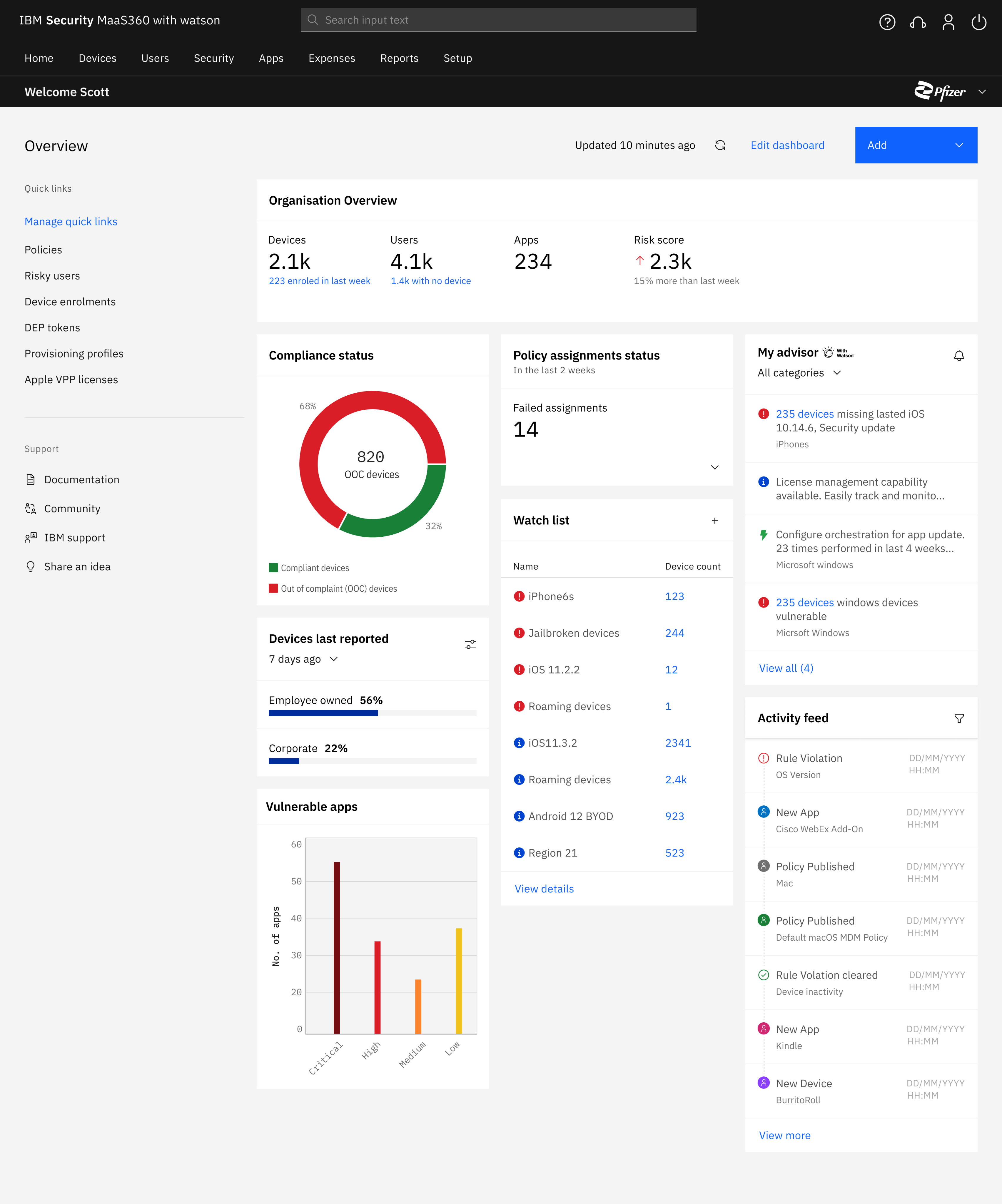
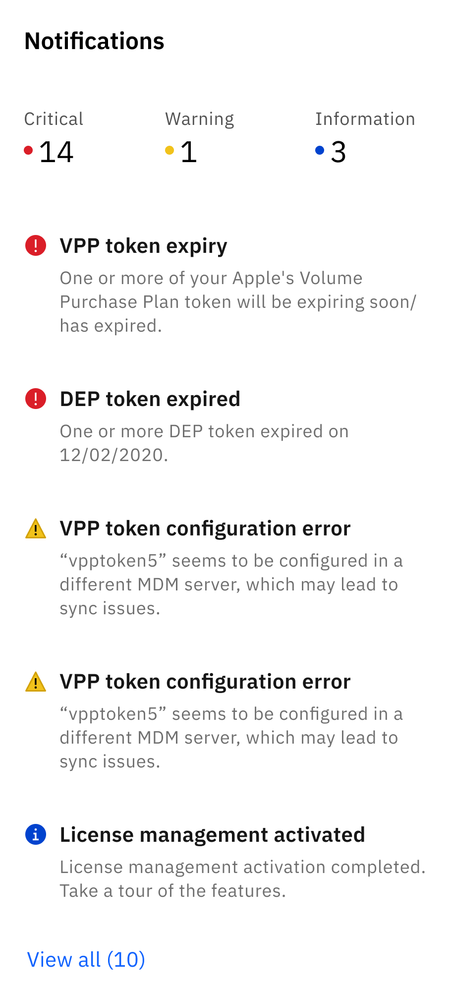
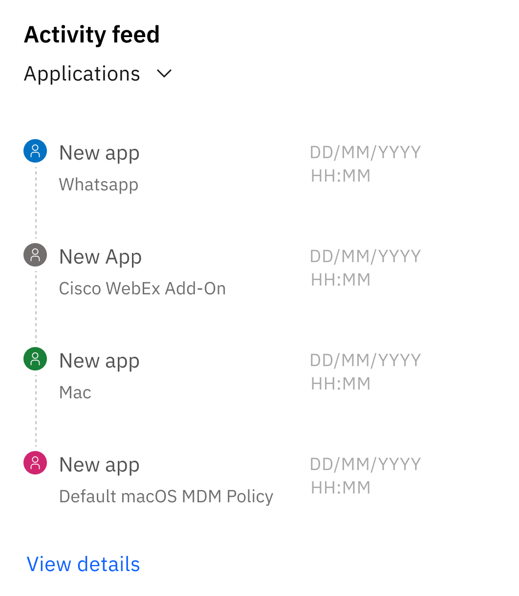
Displays KPIs from critical segments of the product. The homepage provides an overview of key statuses for which admins previously had to navigate deep within the product to access.
I can provide more details about the widgets over a conversation 😁
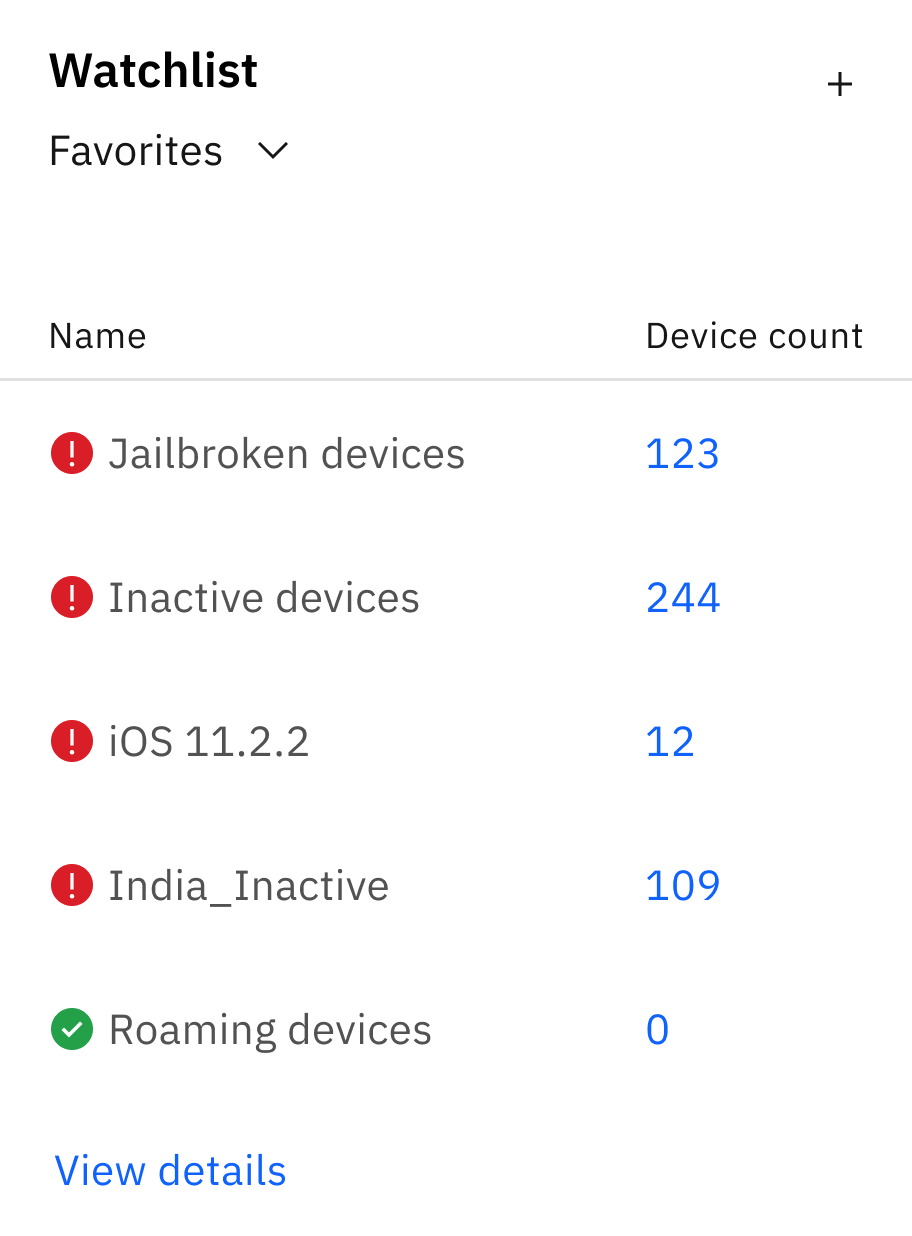
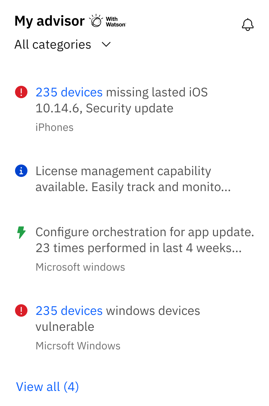
Flexible architecture
Maintains page structure and accommodates a range of data types
Personalisation
Offering complete customisation for their use case.
Flexible architecture allows for complete customisation. IT admins can easily change the default setup by dragging and dropping widgets from a (growing) library.
Wrapping it up 🎁
Defining Objectives and Key Results (OKRs)
Without a product manager, the initiative had to be taken to research, and define metrics for success.
This involved gaining a deep understanding of the business, market and product; collaborated with the director to define OKRs
Systems thinking
Revamping the homepage required unifying the entire product, a design that will stay central for the next 7-8 yrs.
To deliver, I mapped a deep understanding various dependencies and its interrelationships, ensuring each decision aligns with the product’s long-term direction.
Stakeholder management
Aligning stakeholders and the leadership was crucial to ensure value realisation.
The process honed my communication and management skills, collaborating closely with technical leaders and executives.
It doesn't need end here. 🌼
Modernizing MaaS360’s dashboard
Led and owned the design process -
- Defined business value
- Conducted user research
- Created design framework
- Delivered dev ready mockups
- Facilitated user feedback sessions
- Drove C-suite consensus to push to production
The facts
~
60
%
Adoption rate during beta testing

72
%
No:of clicks for key workflows
27
%
Time to complete key workflows
The art
Problems with the existing homepage
Lack of a summarized system status
IT admins are required to view multiple pages to gather information, to later piece it together from memory to form a complete understanding.
Deep and lengthy navigation paths
Our product offers a rich amount of information, however users need to follow lengthy workflows to find the details they need.
Lack of flexibility
Existing capabilities lack contextualization, adding unnecessary noise/information to customers with specific needs.
The homepage
should help IT admins
begin with their day
The older homepage, designed in 2012, lacks tools for quick monitoring, support data-driven decisions, and efficient management of their deployment. Admins were forced to navigate deep into the product to find relevant data.
It was important to establish the ( Need ) for modernising and
( Ensure ) all ( Stakeholders ) were aligned.
Gaining
Stakeholder
Buy in
To create customer benefit and bring this to life complete stakeholder support was required. I focused on articulating the problem in a way that resonated with the stakeholders’ priorities and needs.
Prioritisation

Partyyyyyyyyyy 🎉
Let’s ship
After multiple rounds of collaborative workshops, this project received executive support. The long journey from an internship concept to productisation was a happy moment.
With the gears set in motion, it was time to flesh out the user experience!
Data widgets reduced no:of clicks by 72%
Designed micro layout systems to ensure consistency and scalability with future widgets
Displays KPIs from critical segments of the product. The homepage provides an overview of key statuses for which admins previously had to navigate deep within the product to access.
I can provide more details about the widgets over a conversation 😁
Flexible architecture
Maintains page structure and accommodates a range of data types
Personalisation
Offering complete customisation for their use case.
Flexible architecture allows for complete customisation. IT admins can easily change the default setup by dragging and dropping widgets from a (growing) library.
Wrapping it up 🎁
Defining Objectives and Key Results (OKRs)
Without a product manager, the initiative had to be taken to research, and define metrics for success.
This involved gaining a deep understanding of the business, market and product; collaborated with the director to define OKRs
Systems thinking
Revamping the homepage required unifying the entire product, a design that will stay central for the next 7-8 yrs.
To deliver, I mapped a deep understanding various dependencies and its interrelationships, ensuring each decision aligns with the product’s long-term direction.
Stakeholder management
Aligning stakeholders and the leadership was crucial to ensure value realisation.
The process honed my communication and management skills, collaborating closely with technical leaders and executives.
It doesn't need end here. 🌼
Modernizing MaaS360’s dashboard
Led and owned the design process -
- Defined business value
- Conducted user research
- Created design framework
- Delivered dev ready mockups
- Facilitated user feedback sessions
- Drove C-suite consensus to push to production
The facts
~
60
%
Adoption rate during beta testing

72
%
No:of clicks for key workflows

27
%
Time to complete key workflows
The art
Problems with the existing homepage
Lack of a summarized system status
IT admins are required to view multiple pages to gather information, to later piece it together from memory to form a complete understanding.
Deep and lengthy navigation paths
Our product offers a rich amount of information, however users need to follow lengthy workflows to find the details they need.
Lack of flexibility
Existing capabilities lack contextualization, adding unnecessary noise/information to customers with specific needs.
The homepage
should help IT admins
begin with their day
The older homepage, designed in 2012, lacks tools for quick monitoring, support data-driven decisions, and efficient management of their deployment. Admins were forced to navigate deep into the product to find relevant data.
It was important to establish the ( Need ) for modernising and ( Ensure ) all ( Stakeholders ) were aligned.
Gaining
Stakeholder
Buy in
To create customer benefit and bring this to life complete stakeholder support was required.
I focused on articulating the problem in a way that resonated with the stakeholders’ priorities and needs.
Prioritisation

Partyyyyyyyyyy 🎉
Let’s ship
After multiple rounds of collaborative workshops, this project received executive support. The long journey from an internship concept to productisation was a happy moment.
With the gears set in motion, it was time to flesh out the user experience!
Data widgets reduced no:of clicks by 72%
Designed micro layout systems to ensure consistency and scalability with future widgets
Displays KPIs from critical segments of the product. The homepage provides an overview of key statuses for which admins previously had to navigate deep within the product to access.
I can provide more details about the widgets over a conversation 😁
Flexible architecture
Maintains page structure and accommodates a range of data types
Personalisation
Offering complete customisation for their use case.
Flexible architecture allows for complete customisation. IT admins can easily change the default setup by dragging and dropping widgets from a (growing) library.
Wrapping it up 🎁
Defining Objectives and Key Results (OKRs)
Without a product manager, the initiative had to be taken to research, and define metrics for success.
This involved gaining a deep understanding of the business, market and product; collaborated with the director to define OKRs
Systems thinking
Revamping the homepage required unifying the entire product, a design that will stay central for the next 7-8 yrs.
To deliver, I mapped a deep understanding various dependencies and its interrelationships, ensuring each decision aligns with the product’s long-term direction.
Stakeholder management
Aligning stakeholders and the leadership was crucial to ensure value realisation.
The process honed my communication and management skills, collaborating closely with technical leaders and executives.
It doesn't need end here. 🌼